
#webapplication
Trainers App
Fully functional Front-end and Backend Web Application. Learn & Connect with experts that you need.


#webapplication
Trainers App
Fully functional Front-end and Backend Web Application. Learn & Connect with experts that you need.
”Appify Digital“ wanted to develop the project only in its initial MVP phase,
containing a reduced number of
features to satisfy early customers and gather information on how to improve in the
future. The duration of
development for the initial phase was 3 and a half months, from beginning of January, to
mid April 2020.
Our client's product is “Trainers App, a web based platform for connecting
training
providers with consumers interested in
enrolling into courses or applying for teaching jobs. In the never-ending search for new
skills and knowledge, our client
envisioned making an all-encompassing corpus of training related jobs and courses,
designed to satisfy everyone's wishes.
The courses and jobs offered on the platform range from business to personal development and will in the initial MVP phase cover only Ireland and the UK with the intention of covering courses and jobs for trainers all over the world.
Trainers App web app is made for any Training company and trainers wishing to sell on-line, but also on-site courses, as well as freelance trainers who are interested in applying for one of the positions as a teacher of a course. The consumers can freely browse through the whole website to find the course which suits them best, and after finding the best fit for them open an account to be able to apply.
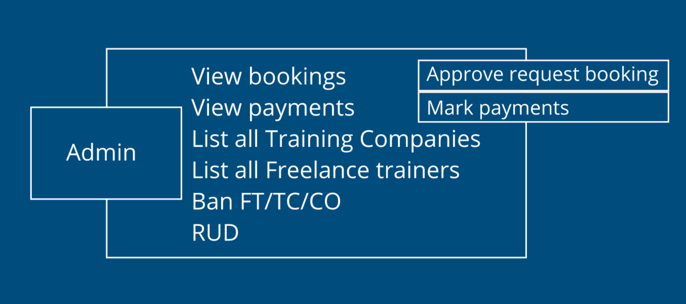
Trainers App administrators are responsible for managing logistics, course and job applications, and payments for other stakeholders.
Freelance trainers can also run private or public training courses, and make themselves available for companies to hire for a teaching job.
Training companies can run private or public training courses. This platform allows them to publicize, advertise and market courses of any type: online courses, in-house courses, location-based courses.
Consumers are a user
group that can browse training courses and book them. They can
browse
courses without making an official account, but if they decide to book a course, they will need to
make
one,
editable by the administrator, with some information they can edit themselves.
The website is based on offering two major services: courses and jobs.
In the MVP stage, we developed necessary features to help customers easily use the platform, bearing in mind to make only the features designed to build trust with customers.
After finishing the course, each attendee can leave a review on the course page, which is visible to everyone, but most importantly, new possible attendees.
Freelance trainers have the possibility to apply for a teaching position on Trainers App. As every course and job have categories to be filtered by on the website, so do the freelance trainers. Based on the categories they chose, they can apply for a job including the same categories.
JOBS
REVIEWS
COURSES


Since this MVP project is large, covering 4 different user groups with each of them having different profiles and information on them, payment process and a large list of courses and jobs, the team was given the freedom to communicate to the client what is the optimal and realistic number of functions which could be delivered in a short amount of time of 3 and a half months.
Moreover, using the information we received from the product owner and the client, the team assessed the size of the suggested functions and features, and informed the client about the choice and the extent of the features that can be developed in the agreed time.
However, our starting point was analyzing epics, a group of specific work with a common objective, which were provided to us by the product owner.
Technical documentation describes the feature set and the system behind Appify’s Trainers App Web Application. It is intended for use by the project manager, technical lead, and the rest of the team to help guide the development process. With it we could not only estimate the time and cost of the project, but also stay close to the agreed brief with the clients during the development, making sure we deliver on schedule and on budget.
It includes main components of all website features, UI/UX design, and actual development of the MVP project: product scope and website complexity.

Using the Agile Scrum Methodology the team followed through all iterations in the scheduled time. This methodology relies on incremental development, and promotes effective communication between the team members and the client.
Applying the method of “sizing“ and using the Fibonacci scale, the team broke down the whole project into manageable tasks. Our project consisted of 6 two-week sprints, and each of them consisted of 50 story points on average.
Afterwards, we grouped the user stories together and divided them into 5 epics. Alongside the epics, we managed tasks that were regarded as a foundation for development, including setting up the app architecture, managing content creation with the client and setting up for the deployment of the application, among other tasks.
Daily meetings of 15 minutes on average were rudimentary for the internal team every morning to be able to keep up-to-date on the tasks finished the day before, plans for that day and possible blockers.
In addition to the internal meeting, in the mornings we would also check in with the client to fill them in on our progress, as well as receive some important information from them.
Design meetings were regularly held in the beginning stages, as well as throughout the development process, to make sure we were on the same page as the client.
Showcase meetings - at the end of each sprint, our client, project manager and technical lead would set aside a time for an hour long meeting in which we showcased our progress. These meetings were not only important to keep the client up-to-date, but also to build trust and good communication between everyone involved in the project.
Sprint planning - After each of the sprints, the internal team would look at the remaining user stories and tasks, count the story points left to complete and divide them into manageable increments for the next two-week period.
An hour of sprint planning meeting was always followed by a sprint review. We shared everything we thought was an issue in the last sprint and could be improved in the next one. This approach enhanced our workflow.


As in any project, changes are not a rare occurrence and they are oftentimes welcome. However, if a client doesn't have a technical background, they might ask for some alterations which can turn out to be foundational. These changes would require a structural modification and therefore couldn`t be applied. Nonetheless, we always tried to find the alternative ways to approach every inquiry from the client.
The biggest issue with modifying the initial structure of the web application according to the clients` inputs later in the development, is the so-called „triple constraint“. This model represents the dependency level of three points: budget, cost, scope. If one of the three points ”suffers“, the two others will directly be affected. Project manager and the tech lead had to understand how to assess the possible alteration while communicating with the client, present it to the team and together reach a decision on which action to take.
The beginning stages of our project development consisted of making the WBS, work breakdown structure, using Agile methodology and Jira tool.
After creating the infrastructure of the app as well as UML Diagrams, we could start backend and frontend coding.
#A wireframe is a visual representation of a user interface.
To better understand the flow of this web application in its MVP phase, according to which the developers would code, the designer made a wireframe.
According to technical documentation, the team put to paper the logistics behind the project, focusing on implementing good user experience and user interface practices.
The production of the wireframe was created in great detail, including specifications for each user group.
For example: Training Company is the second user group with the most responsibilities.
After signing up, which had to be approved by the admin manually via email, logging in/logging out and resetting the password if forgotten, the Training Company had a couple of options.
They could:
1. Post a course and edit the majority of the information on it
2. Search trainers, show profiles of freelance trainers, show courses
3. View profiles and edit them
4. Post jobs
5. View jobs on the job board
6. View Training Companies with their booking information
7. Delete accounts
Furthermore, the wireframe included the payment method - direction Consumer to Trainers App and Training Company to Trainers App.
UML Diagrams and the user flow:
Unified Modelling Language Diagram, short UML Diagram, is a digital modelling scheme that represents
the flow of the app,
which the team used to visually outline all actions each of the 4 user groups can take in this app.
This is a very concise representation of the web app, which allows designers, developers, and the
rest of the team to have
a very clear and easily accessible referral scheme. The actions are separated by user type and show
all the options each group has in a very abstract way.

Database modeling:
We created a logical structure of the database including the relationships and restrictions of the
entities.
For example, the connection between the course and the users - what is the relationship between the course entity and the user entity. This method has proven to be very useful as we could not only refer to it whenever needed, but also make later decisions on whether to implement a new feature or not.
Technologies used for backend development:
The API was written in Typescript using Node.js environment and Express.js framework. We followed SOLID principles and custom onion architectural approach in writing reliable code.
Database of our choice was MongoDB and Mongoose object modeling. To keep track of all the model relationships, we have made several diagrams in various tools, and to keep track of all the requests that were created, we used Postman collections.
Technologies used for frontend development:
The website was made with React.JS library, and we used Redux library for managing and handling a couple of different user entities, as well as Bootstrap as our main UI library.
Features are implemented with REST API.
We used MERN stack for this app, and special attention was given to the mobile version of the website.


Since we worked in agile methodology, we added several changes both in
wireframes
and visual design guide during the process of developement. However, looking at the bigger
picture,
this method saved us a lot of time both for designers and developers.
After developers implemented design on the actual website, we ran tests and did the design review. The designer then communicated with the developers how to adjusted the fixes accordingly and the project was completed.
The website was made with React.JS library, and we used Redux
library
for managing and handling a couple
of different user entities, as well as Bootstrap as our main UI library.
We implemented the features using REST API and MERN stack.
We made one website, one URL, but 3 different versions of the
website, which depend on the user identity/user type.
In accordance with different user identities we have made different features.
Commonality for all users types is the process of authorization. Registration differs from user
type to
user type,
and some users have to submit more details upon registration. After finishing the registration
process,
and logging in
as a specific user type, users have access to specific pages and set of actions and features.


By creating two seperate design files, we made a system which
provides the developers with outlines to code according to. This way, developers didn't have to wait for
the completion of the visual design in order to start building the app.
In the file for visual design, the developers could easily extract files they needed (such as for a look of a specific button), and download all assets that exist in design for this app.
We made an intuitive web-based platform in its MVP phase, which the clients and the development team love.
The consumers now have a place where they can easily find and apply for any course or training job they are interested in.
Our client has the possibility to communicate with the consumers through the review system, allowing them to implement customers wishes in the next stage of development.


